 Office Solutions Pro
Build a horizontal process flow component in Power Apps
Create a reusable canvas component that shows the steps of a process as SVG icons joined by lines, and highlights each step as it is completed.
On this page
- Overview
- Before you begin
- 1. Create the component and set up the app
- 2. Add the custom properties
- 3. Define the steps
- 4. Add the container and gallery
- 5. Set up the icon and title
- 6. Add the connecting lines
- 7. Color each step by its status
- 8. Add SVG icons
- 9. Draw the icon in the right color
- 10. Use it in an app
- Customize the look
- Troubleshooting
A process flow tells people where they are in a multi-step task, such as a request form split into sections. This walkthrough builds one as a component, so you can drop it into any app and set it up through properties instead of rebuilding it each time.

The finished component:
- Reads its steps from a table, so you can change the titles, icons, and number of steps.
- Spreads the steps evenly across its width.
- Draws each icon from SVG text, so you can use thousands of free icons.
- Changes a step’s color and background when you mark it complete.
It is designed for steps on a single screen, such as the sections of one form. A flow that tracks a record’s status across an app is usually better built inside that app.
Before you begin
You need:
- Permission to create a canvas app or component library in your Power Apps environment.
- Basic comfort with galleries and Power Fx formulas.
Use a component library if you plan to reuse the component. Component libraries let you share and update components, and apps that use them are told when an update is available.
Two limits are worth knowing first:
- You can’t insert a component into a gallery or a form. Place the process flow on the screen, above your form.
- This design tracks completion with one true or false property per step. The walkthrough builds four. For more steps, add more properties, as described in Step 10.
1. Create the component and set up the app
- Create a component library, or open the one you use. Add a new component and rename it
Process Flow. - In Settings > Display, choose Landscape.
- In Settings > Updates, turn on modern controls and themes.
- Check that Enhanced component properties is on. It is on by default for new apps; for existing apps, turn it on from the New tab under Settings > Updates.
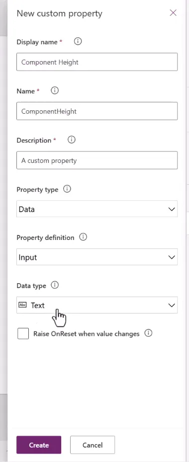
Every property in this walkthrough is a Data property with an Input definition, which is how the app passes values into the component.
2. Add the custom properties
Select the component, then use New custom property to create each of these. After creating each one, set its default value in the formula bar.
| Display name | Name | Data type | Default value |
|---|---|---|---|
| Component Color | ComponentColor | Color | RGBA(0, 0, 0, 0) |
| Component Height | ComponentHeight | Number | 100 |
| Items | Items | Table | See Step 3 |
| Icon Size | IconSize | Number | 60 |
| Font Size | FontSize | Number | 14 |
| Completed Color | CompletedColor | Color | RGBA(7, 112, 184, 1) |
| Incomplete Color | IncompleteColor | Color | RGBA(0, 0, 0, 1) |
| Completed Fill | CompletedFill | Color | RGBA(238, 204, 204, 0.4) |
| Step 1 Complete | Step1Complete | Boolean | false |
| Step 2 Complete | Step2Complete | Boolean | false |
| Step 3 Complete | Step3Complete | Boolean | false |
| Step 4 Complete | Step4Complete | Boolean | false |
| Icon List | IconList | Table | See Step 8 |
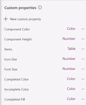
New Color properties default to black, and new Number properties default to 100, so check each default as you go. Keep Completed Fill partly transparent, because it is laid over the icon and title.
Then set the component’s own size:
- Width:
App.Width - Height:
'Process Flow'.ComponentHeight
3. Define the steps
Set the Items property to a table with one record per step:
Table( { Step: 1, Icon: "FormProcessing", Title: "Request Details" }, { Step: 2, Icon: "Documentation", Title: "Add Documents" }, { Step: 3, Icon: "Org", Title: "Add Organization" }, { Step: 4, Icon: "PeopleAdd", Title: "Add Signers" })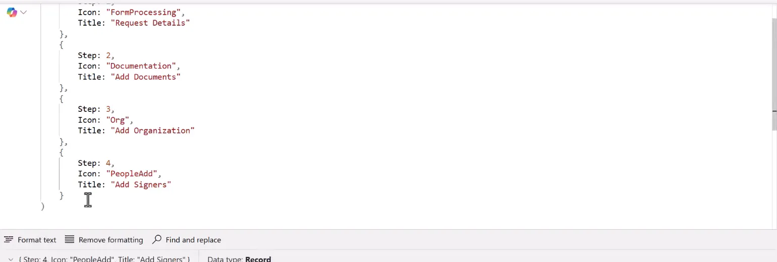
- Step numbers the steps in order, starting at 1.
- Icon is a name you look up in the icon list in Step 8, not a built-in icon.
- Title is the label shown under the icon.
4. Add the container and gallery
- Add a Horizontal container, rename it
conProcessFlow, and set:- Width:
'Process Flow'.Width - Height:
'Process Flow'.Height - Fill:
'Process Flow'.ComponentColor - Border style: None
- Padding:
0for Top, Bottom, Left and Right. A new Horizontal container starts with some padding, which leaves the gallery less room than its steps need, so the gallery scrolls and its scrollbar covers the titles.
- Width:
- Inside it, add a Horizontal gallery, rename it
galProcessFlow, and set:- Items:
'Process Flow'.Items - Width:
'Process Flow'.Width - Height:
'Process Flow'.Height - Minimum height and Minimum width:
1 - Template padding:
0 - Template size:
- Items:
'Process Flow'.Width / Max(1, CountRows('Process Flow'.Items))Dividing the width by the number of steps gives each step an equal share, so the layout adjusts when you add or remove steps.
- Count the input table, not the gallery.
'Process Flow'.Itemsis the table the app passes in, so the count is right as soon as the component loads. A gallery’s AllItems holds only the items it has loaded, and the formula would refer to the gallery from its own property. - No steps. Max keeps the divisor at 1 or more, so an empty table doesn’t divide by zero. The gallery is simply empty.
- Padding. TemplatePadding is the distance between items, and the formula leaves no room for it. Keep it at
0. Padding would also open gaps between the connecting lines in step 6.
- In the gallery template, delete the subtitle, and rename the remaining controls
lblTitle(the text) andimgIcon(the image).
5. Set up the icon and title
imgIcon (the image):
| Property | Value |
|---|---|
| Image position | Fit |
| Width and Height | 'Process Flow'.IconSize |
| Padding | Top 5, Bottom 0, Left 10, Right 10 |
| X | (Parent.TemplateWidth / 2) - (Self.Width / 2) |
| Y | 0 |
The left and right padding come out of the icon’s size, so an icon size of 60 draws a 40-pixel icon.
lblTitle (the text):
| Property | Value |
|---|---|
| Text | ThisItem.Title |
| X and Y | 0 |
| Width | Parent.TemplateWidth |
| Height | galProcessFlow.TemplateHeight |
| Size | 'Process Flow'.FontSize |
| Text alignment | Center |
| Vertical align | Bottom |
| Padding | Left 10, Right 10, Bottom 2 |
The label fills the whole cell and puts its text at the bottom. That lets its fill shade the entire step later. If a long title wraps, it grows upward, so check that it doesn’t overlap the icon.
6. Add the connecting lines
- In the gallery template, select Insert > Icons > Horizontal line. Rename it
icoLineStart. - Set:
- Height:
Parent.TemplateHeight - Y:
0 - X:
0 - Width:
Parent.TemplateWidth / 2 - imgIcon.Width / 2
- Height:
- Copy it, paste it into the template, and rename the copy
icoLineEnd. Change its X to:
Parent.TemplateWidth / 2 + imgIcon.Width / 2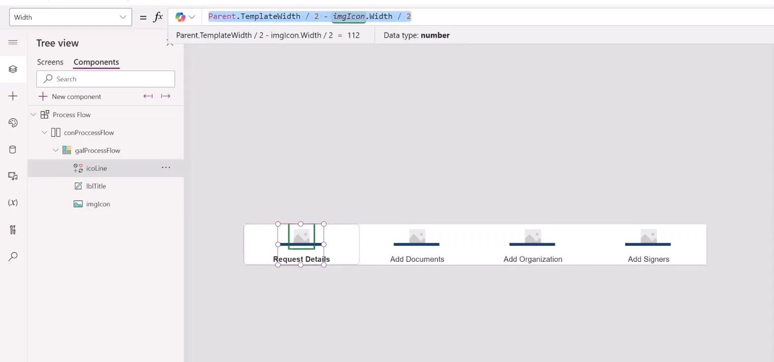
The line icon grows thicker as it grows longer. That suits this design. If you want a line of fixed thickness, use a thin Rectangle instead and set its Fill.
Hide the lines that would stick out at each end:
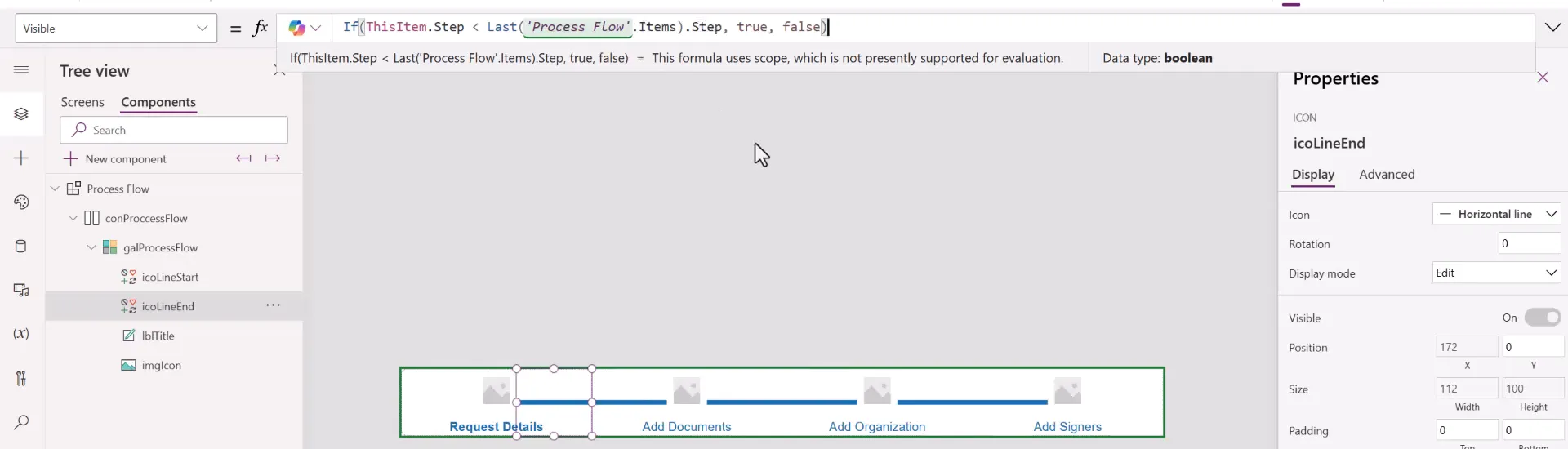
- icoLineStart > Visible:
If(ThisItem.Step = 1, false, true)- icoLineEnd > Visible:
If(ThisItem.Step < Last('Process Flow'.Items).Step, true, false)Comparing against the last step, instead of the number 4, keeps the end correct when you change the number of steps.
7. Color each step by its status
Select icoLineStart, icoLineEnd, and lblTitle together, and set Color:
If(ThisItem.Step = 1 && 'Process Flow'.Step1Complete, 'Process Flow'.CompletedColor,If(ThisItem.Step = 2 && 'Process Flow'.Step2Complete, 'Process Flow'.CompletedColor,If(ThisItem.Step = 3 && 'Process Flow'.Step3Complete, 'Process Flow'.CompletedColor,If(ThisItem.Step = 4 && 'Process Flow'.Step4Complete, 'Process Flow'.CompletedColor,'Process Flow'.IncompleteColor))))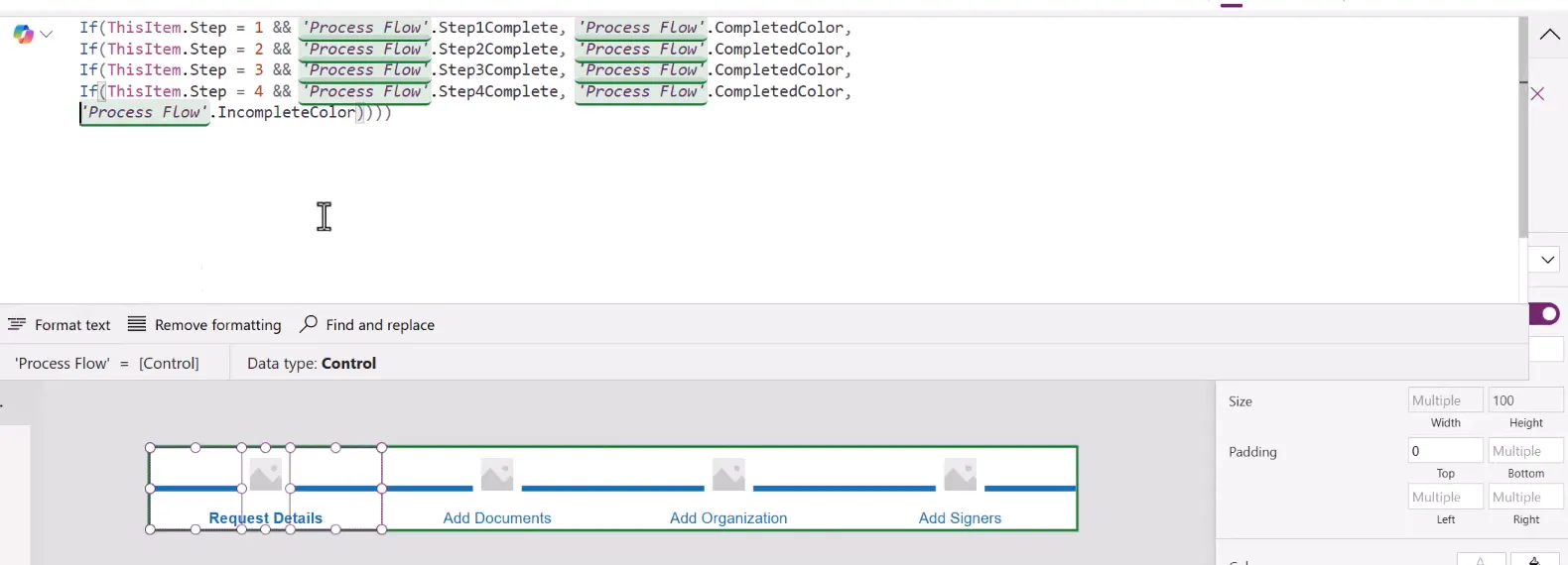
Then select lblTitle alone, and set Fill:
If(ThisItem.Step = 1 && 'Process Flow'.Step1Complete, 'Process Flow'.CompletedFill,If(ThisItem.Step = 2 && 'Process Flow'.Step2Complete, 'Process Flow'.CompletedFill,If(ThisItem.Step = 3 && 'Process Flow'.Step3Complete, 'Process Flow'.CompletedFill,If(ThisItem.Step = 4 && 'Process Flow'.Step4Complete, 'Process Flow'.CompletedFill,RGBA(0, 0, 0, 0)))))Bring lblTitle to the front of the template. Its fill then shades the whole step, including the icon.
8. Add SVG icons
The icons come from SVG text stored in the IconList property. Each record has three fields:
- Name: must match an Icon value in Items.
- Code: optional, but useful for finding the icon again later.
- Data: the SVG markup.
To add an icon from Bootstrap Icons, a free icon library released under the MIT license:
-
Find an icon, and copy its SVG from Copy HTML. The code point, such as
F5F8, is shown on the same page.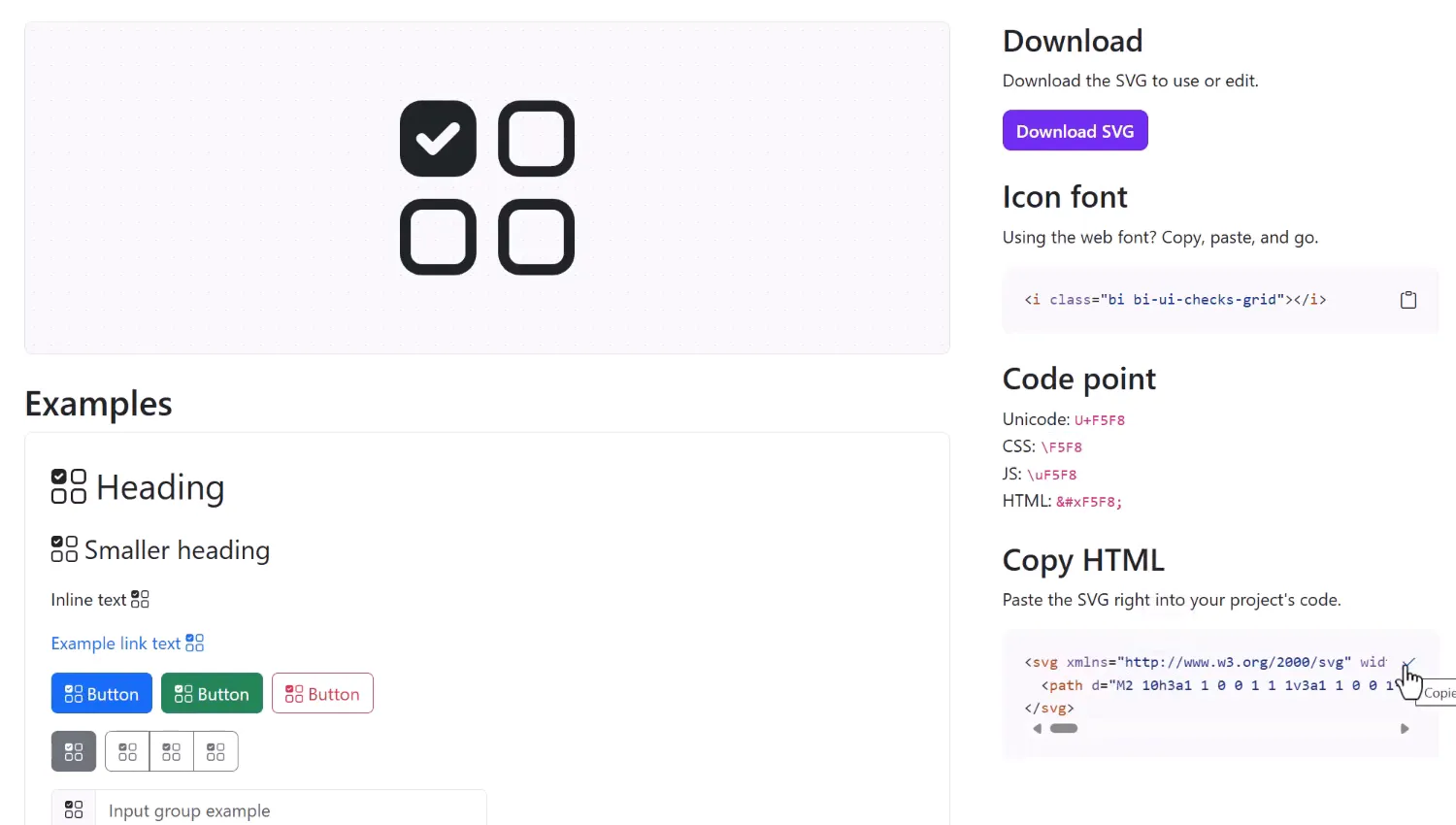
-
Paste the SVG into a text editor, and replace every double quote (
") with a single quote ('). Power Fx uses double quotes to mark the start and end of text. -
Paste the result between the quotes of Data.
For a ready-made list for the four steps above, set IconList to the contents of icon-list.txt. It holds Bootstrap’s file-earmark-text, files, diagram-3, and person-plus icons, already converted.
You can store many icons in this table. Avoid showing a very long icon list in a gallery, though; keep large icon libraries in SharePoint or Dataverse if you need to browse them.
9. Draw the icon in the right color
Bootstrap icons use currentColor as their fill. This formula swaps it for the step’s color, then turns the SVG into an image. Set imgIcon > Image to:
"data:image/svg+xml;utf8," & EncodeUrl( Substitute( LookUp('Process Flow'.IconList, Name = ThisItem.Icon).Data, "currentColor", Substitute( JSON( If(ThisItem.Step = 1 && 'Process Flow'.Step1Complete, 'Process Flow'.CompletedColor, If(ThisItem.Step = 2 && 'Process Flow'.Step2Complete, 'Process Flow'.CompletedColor, If(ThisItem.Step = 3 && 'Process Flow'.Step3Complete, 'Process Flow'.CompletedColor, If(ThisItem.Step = 4 && 'Process Flow'.Step4Complete, 'Process Flow'.CompletedColor, 'Process Flow'.IncompleteColor)))) ), """", "" ) ))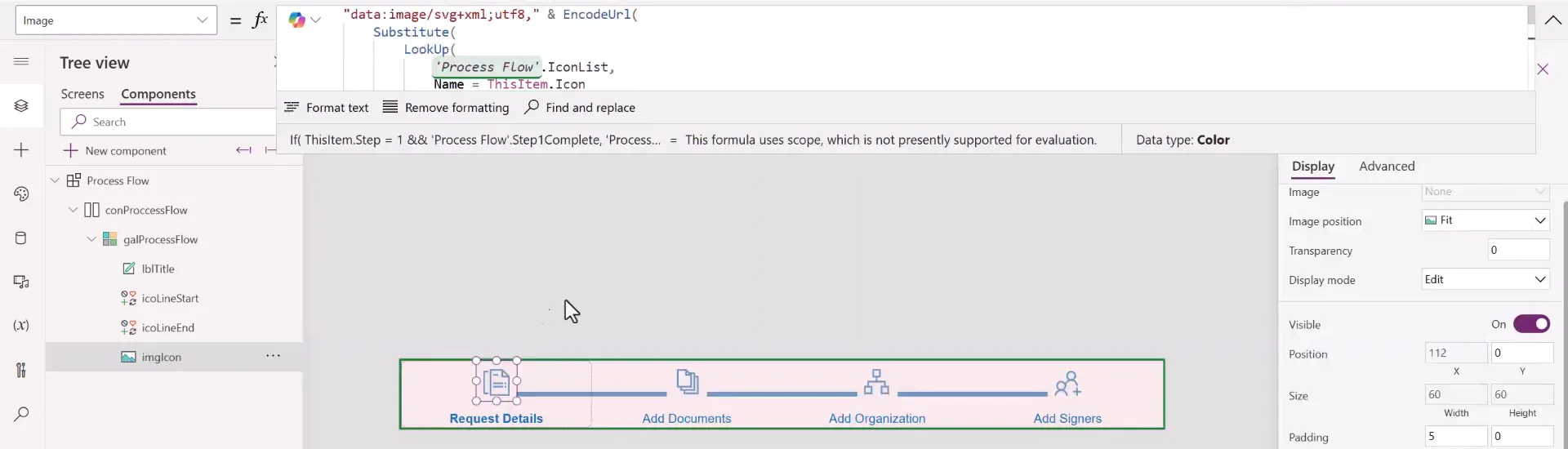
Here is what each part does:
- LookUp finds the icon whose Name matches the step’s Icon.
- JSON turns a color into text such as
"#0770b8ff". Colors become an 8-digit hexadecimal string. - The inner Substitute removes the quote marks around that text.
- The outer Substitute puts the color in place of
currentColor. - EncodeUrl encodes the characters so the SVG works as an image address.
Save and publish the component library.
10. Use it in an app
-
In your app, select Insert > Get more components, and import the component from your library. You can also test it first on a screen inside the library.
-
Add Process Flow to the top of your screen.
-
Set each Step Complete property on the component to a variable. The example uses variables with the same names as the properties, such as
Step1Complete.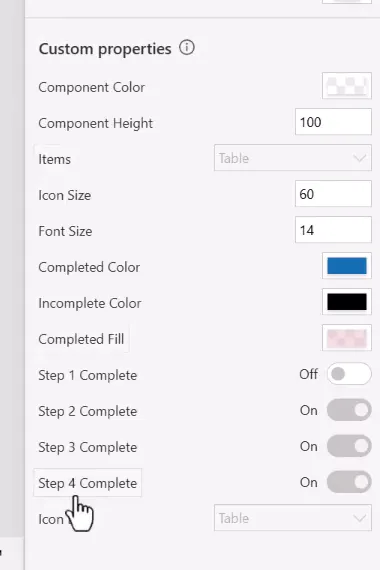
-
Set the variable when a step is done. In the example, each button marks its step:
Set(Step1Complete, true)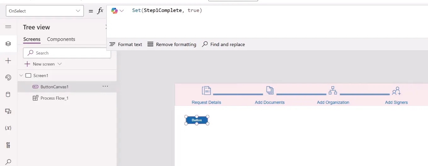
- Reset the steps when the screen opens, in the screen’s OnVisible:
Set(Step1Complete, false);Set(Step2Complete, false);Set(Step3Complete, false);Set(Step4Complete, false)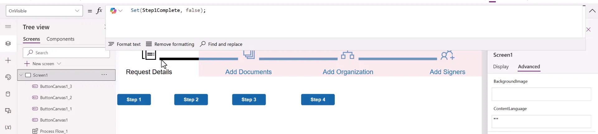
In a real form, the button that moves to the next section would set the variable and show that section.
Test it by playing the screen and marking the steps:


Steps don’t have to complete in order. Each step only looks at its own property.
Add more steps
Adding a record to Items adds a step, and the layout resizes on its own. To make a fifth step show as complete, you also need to:
- Add a
Step5CompleteBoolean property to the component. - Add a line for step 5 to the Color, Fill, and Image formulas.
- Add an icon for it to IconList.
Customize the look
These are all component properties, so you can change them in each app:
- Completed Fill: lower the alpha value for a lighter shade.
- Completed Color and Incomplete Color: match your theme.
- Component Color: a background for the whole flow. Check the incomplete color still shows, for example on a dark background.
- Icon Size and Font Size: fit your layout.
Troubleshooting
| Symptom | Likely cause | What to do |
|---|---|---|
| Only one step shows, or steps are squeezed | Minimum width or Template size is wrong | Set the minimum width to 1 and use the Template size formula from Step 4 |
| The last step is cut off, the gallery scrolls, or a scrollbar covers the titles | Template padding or the container’s Padding isn’t 0 | Set both to 0, as in Step 4 |
| An icon is blank | The name in Items doesn’t match IconList, or the SVG still has double quotes | Check the Name values, and replace " with ' in the SVG |
| An icon doesn’t change color | The SVG doesn’t use currentColor | Use an icon that does, or replace its fill color with currentColor |
| A line sticks out past the first or last step | Visible isn’t set on the lines | Use the formulas from Step 6 |
| A fifth step never shows as complete | There’s no property for it | Follow Add more steps |
| The shading covers the title but not the icon | lblTitle isn’t in front | Bring it to the front of the template |
| A long title overlaps the icon | The text wraps upward | Shorten the title, or lower the icon or font size |
| A thin line appears under the component | A border or shadow on a container | Check the border and drop shadow settings |
| You can’t add the component to a form | Components can’t go inside a gallery or form | Place it on the screen above the form |
Companion video
Video: Creating a Dynamic Horizontal Process Flow Component in Power Apps Canvas Apps
If the player is blocked on your network, open the video on YouTube.
Need help applying this to your own setup? Read about consulting.