 Office Solutions Pro
Build a custom SharePoint list form in Power Apps with side navigation
Replace a long SharePoint list form with a branded Power Apps form that splits fields into sections, using a side navigation gallery, modern controls, and required fields.
The default form for a SharePoint list shows every field in one long column. Integrate > Power Apps > Customize forms lets you redesign it while keeping the list’s New, Edit, Save, and Cancel behavior.
This walkthrough builds a project request form for a list named Demo Requested Projects. A gallery on the left acts as navigation, and each selection shows one group of fields.
If you want people to open the form from a button on a page, and return there afterward, see the companion article on opening a SharePoint list form from a page button.
Before you begin
You need:
- A SharePoint list with its columns already created.
- Permission to customize the list.
- Basic comfort with Power Apps properties.
SharePoint is a Standard connector; the complete form still needs appropriate licenses and data permissions.
Three things are worth knowing first:
- Access follows the list. You can’t manually share a customized form. Any user who has at least Read or Restricted View access to the linked list inherits access to the form. People who only have permissions on specific items in the list don’t have access to the customized form.
- Modern controls are optional. They behave differently from classic controls in several places, noted below. You can use classic controls throughout if you prefer.
- The starting layout can differ. Where it’s enabled, new forms use Microsoft’s responsive form template, in which SharePointForm1 sits inside layout containers on a flexible canvas. If your form opens that way, the display settings and starting layout differ from the screenshots here.
A customized form is tied to the list. If you need an app that lives separately, create a canvas app in Power Apps instead.
1. Open the form and set up the app
-
In the list, select Integrate > Power Apps > Customize forms.
-
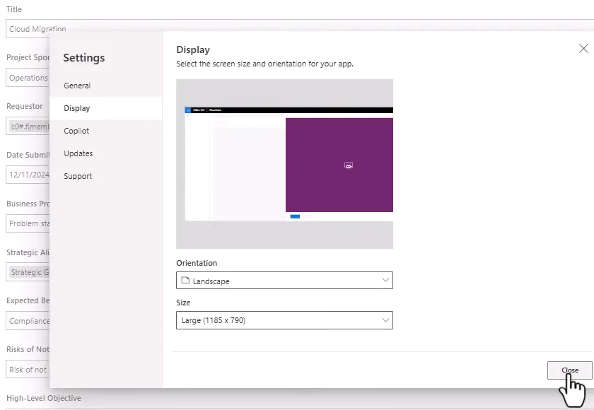
Select Settings > Display, set Orientation to Landscape, and choose a size. The example uses Large.
-
Under Settings > Updates, turn on modern controls and themes.
-
Open Themes, select Add a theme, and set your font and primary color. Enable the option that applies the theme to classic controls.
-
In the Tree view, select SharePointForm1 and turn its Visible property off. Keep this form, because you will reference its settings in Step 8, and it gives you a way back.
2. Add a background and layout
- For the background, upload an image and set it as the screen’s Background image, with Image position set to Fill. A simple way to make one is to draw a full-slide rectangle in PowerPoint, add a gradient fill, and save it as a picture.
- Add three containers to the screen:
| Container | X | Y | Width | Height |
|---|---|---|---|---|
| Top header | 10 | 10 | App.Width - 20 | 100 |
| Left side | 10 | 120 | 240 | App.Height - 130 |
| Main | 260 | 120 | App.Width - 270 | App.Height - 130 |
- Give each a light drop shadow and a Border radius of
20, if you like the look. - In the header, add your logo image and a text control with the form’s title.
3. Build the navigation gallery
-
In the left container, add a Vertical gallery named
galSelectArea. -
Set its Width to
Parent.Width, and set Template size to about60.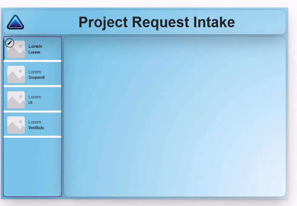
-
Remove the gallery’s sample controls, except one text control, and show
ThisItem.Title. -
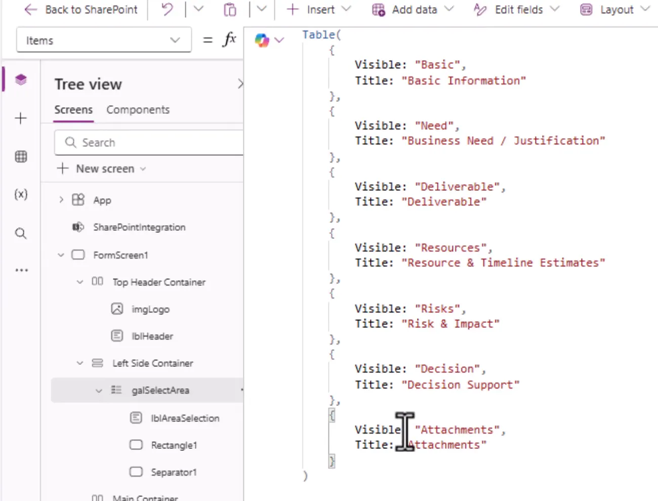
Set the gallery’s Items:
Table( { Visible: "Basic", Title: "Basic Information" }, { Visible: "Need", Title: "Business Need / Justification" }, { Visible: "Deliverable", Title: "Deliverable" }, { Visible: "Resources", Title: "Resource & Timeline Estimates" }, { Visible: "Risks", Title: "Risk & Impact" }, { Visible: "Decision", Title: "Decision Support" }, { Visible: "Attachments", Title: "Attachments" })Title is what people see. Visible is a short code that the form cards use in Step 5.
- To bold the selected section, set the text control’s Font weight:
If(ThisItem.IsSelected, FontWeight.Bold, FontWeight.Normal)4. Add the new form
-
In the main container, add a new Form, and set its data source to your list.
-
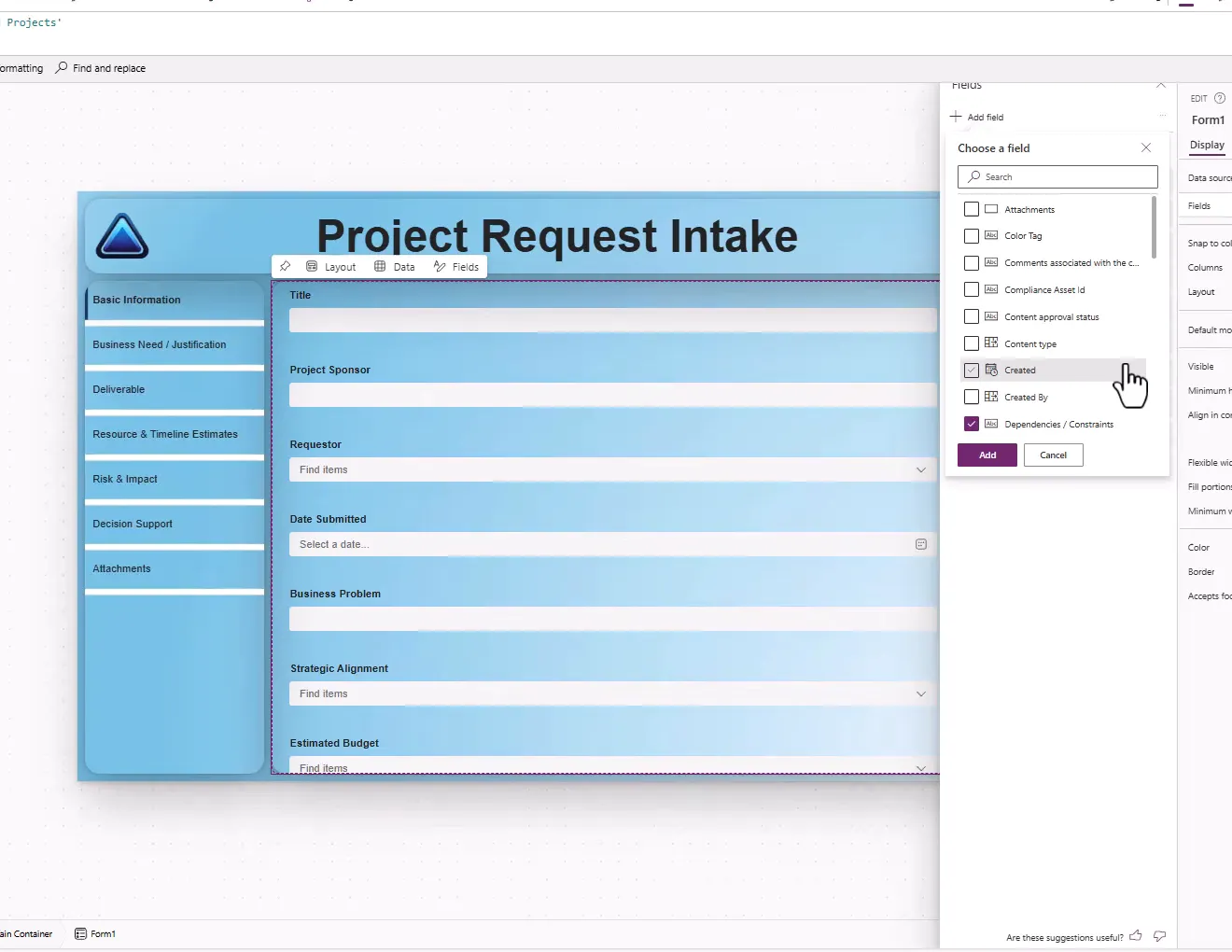
Select Edit fields > Add field, and add every field you want, including Attachments.
-
Put the fields in order.
-
Set Columns to
2, and turn off Snap to columns. -
Rename the form if you wish. The example’s new form is
SharePointForm2. -
Select all the data cards (hold Shift and select each one), then select Unlock.
Add every field before unlocking. Unlocked cards appear as available again in Edit fields, which makes it easy to add a duplicate.
5. Show one section at a time
Select the cards for a section, and set Visible. For the first section:
galSelectArea.Selected.Visible = "Basic"Repeat for each section, using its code:
| Code | Example cards |
|---|---|
"Basic" | Title, Project Sponsor, Requestor, Date Submitted |
"Need" | Business Problem, Strategic Alignment, Expected Benefits |
"Deliverable" | Key Deliverable, High-Level Objective |
"Resources" | Estimated Budget, Estimated Duration, Dependencies, Resources Needed |
"Risks" | Risk Level, Risks of Not Doing the Project, Impact Areas, Change Management Needed |
"Decision" | Urgency, Recommendation from Requestor |
"Attachments" | Attachments |
6. Tidy the layout
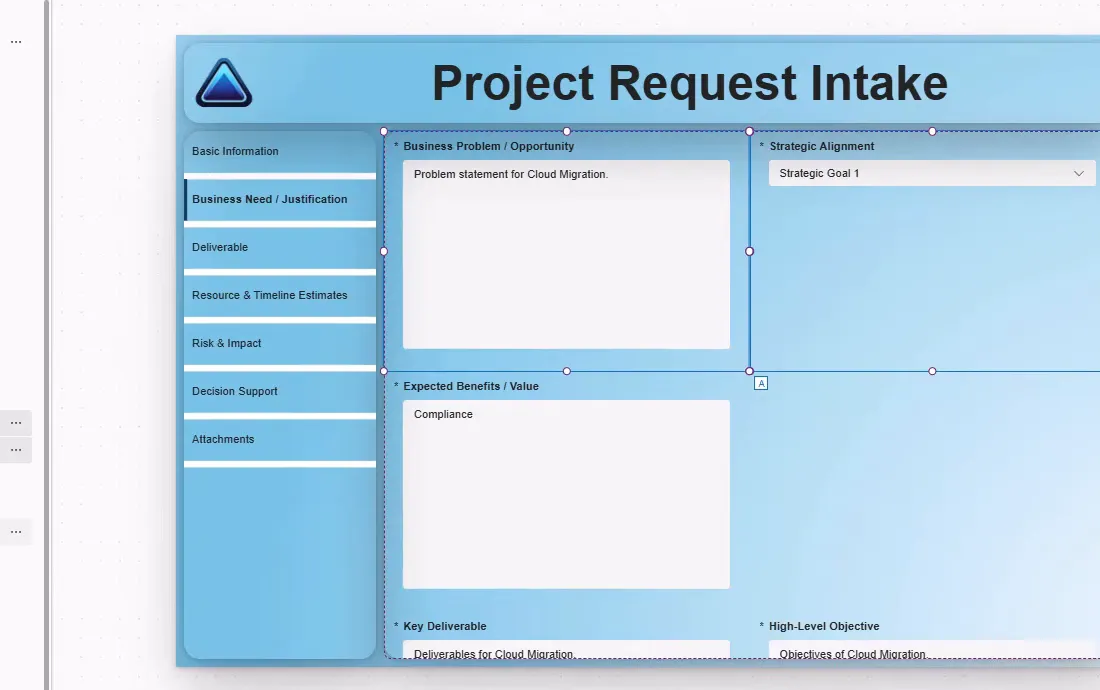
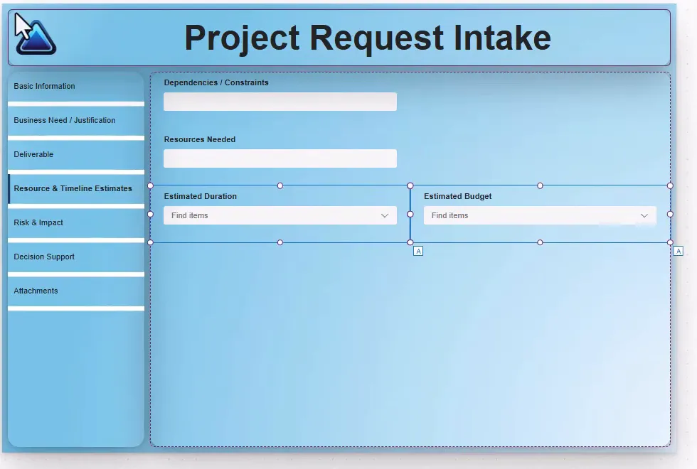
Hidden cards still hold their place in the form’s rows, which leaves odd gaps. Fix this with each card’s position values.
- Set Width on side-by-side cards to
Parent.Width / 2. - Set Y so that cards in the same section row share a value, with each row of the form using its own number. Set X to
0or1for the left or right position. - Keep Y values in sequence across sections. In the example, the rows run from
0to10. - For a card that should span the form, set its width to
Parent.Width.
For long-text fields, make these changes to each modern text input:
- Set Type to Multiline. On a classic text input, the property is Mode.
- Set the card’s Height, such as
300, and the input’s height toParent.Height - 64.
If text sits in the vertical middle of a box when you run the form, you missed the multiline setting on that field.
7. Fix the controls
Labels and prompts. Change card labels to useful wording, such as Project Sponsor (Department), and combo box prompts from Find items to Select Requestor.
Person fields. Modern combo boxes need changes before they work with a Person column.
- Copy the original Items formula into a comment, so that you can restore it.
- Set Items to use the search text:
Choices([@'Demo Requested Projects'].'Requestor', Self.SearchText)- On the Display tab, add the DisplayName field, so that the selected name shows. In the updated combo box, Fields is replaced by ItemDisplayText, so set ItemDisplayText to
ThisItem.DisplayNameinstead.
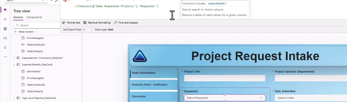
The search text returns only the choices that start with what the person types. Microsoft notes that Choices can’t be delegated, so with a large lookup list, only part of the data may be searched.
Dates. To block past dates on new requests, set the Date Submitted date picker’s Start date to:
If(SharePointForm2.Mode = FormMode.New, Today(), Date(1900, 1, 1))Start date is the earliest date that can be selected, and its default is Date(1900, 1, 1). A plain Today() would also apply when someone edits an older request, whose Date Submitted is already in the past. The date picker would then show today’s date instead of the stored one, and saving the request, even for an unrelated change, would replace the stored date with today’s. The If limits the calendar for new requests only, and uses the default otherwise, so an existing request keeps its stored date unless someone deliberately changes it. This limits the calendar in the form. It doesn’t stop a past date being entered in the list itself.
Attachments. The attachments control is a classic control, so match its label to the others. Replace the label with a modern text control in the same place, and give it the original label’s name, so that references don’t break. Set Max attachments and Max attachment size on the control if needed, and tell people the limits in the label.
Required fields. Select the cards you want to require, and set Required to true. In the example, this is every card except Attachments. An asterisk appears on each one.
Show which section needs attention. When a save fails because a value is missing, SharePoint shows an error banner at the top, and each card that needs a value shows a message. Those cards may be in a section that isn’t showing. To point people to the right section, add a second text control to the navigation gallery’s template, with Text set to "Needs attention", and set its Visible to:
!IsBlank(SharePointForm2.Error) &&Switch( ThisItem.Visible, "Basic", !And(Title_DataCard1.Valid, ProjectSponsor_DataCard1.Valid, Requestor_DataCard1.Valid, DateSubmitted_DataCard1.Valid), "Need", !And(BusinessProblem_DataCard1.Valid, StrategicAlignment_DataCard1.Valid, ExpectedBenefits_DataCard1.Valid), false)Add a line for each section that has required cards, and use your cards’ names from the Tree view. Take the names from the cards in SharePointForm2, not the hidden SharePointForm1. A name with spaces needs single quotes, such as 'Expected Benefits_DataCard2'.Valid. How it works:
- When a save fails validation, the form sets its Error property, so nothing shows before the first save attempt.
- A card’s Valid property says whether it holds a valid entry. A section shows the cue while any of its listed cards isn’t valid, and the cue goes once they all are.
- The cue is text, so it doesn’t rely on color.
Placeholders. Use the Placeholder property on text inputs to give people guidance.
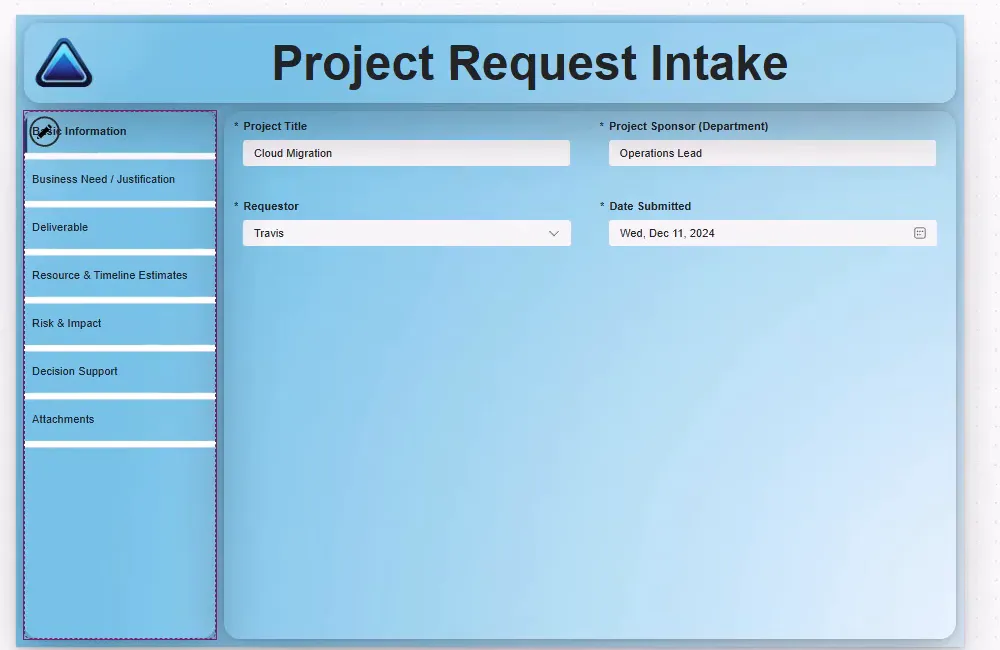
Selected section. To make the current section stand out, set the gallery’s Template fill. For example:
If(ThisItem.IsSelected, App.Theme.Colors.Lighter30, RGBA(0, 0, 0, 0))Check text contrast, especially for accessibility. You may need the same kind of If on the text color.
8. Connect the new form to SharePoint
The original form is linked to the list’s New, Edit, and Save buttons. The new form needs the same connection.
- Copy these properties from
SharePointForm1to your new form:
| Property | Value |
|---|---|
| Item | If(IsBlank(SharePointIntegration.Selected),First([@'Demo Requested Projects']),SharePointIntegration.Selected) |
| OnSuccess | The original formula, changed to reset your new form |
Microsoft’s default OnSuccess resets the form and then calls RequestHide(). On the new form, use your form’s name:
ResetForm(SharePointForm2); RequestHide()- In the Tree view, select SharePointIntegration.
- Change
SharePointForm1to your new form’s name in OnNew, OnView, OnEdit, OnSave, and OnCancel.
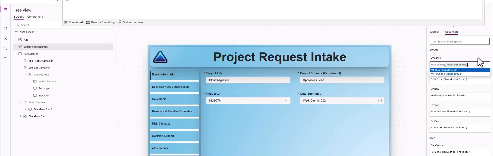
To go back to the original form, change these references back to SharePointForm1 and make it visible again.
9. Publish and test
-
Select Save, and add a version note describing the change.
-
Select Publish to SharePoint, and confirm.
-
Return to the list, refresh, and select Add new item.
-
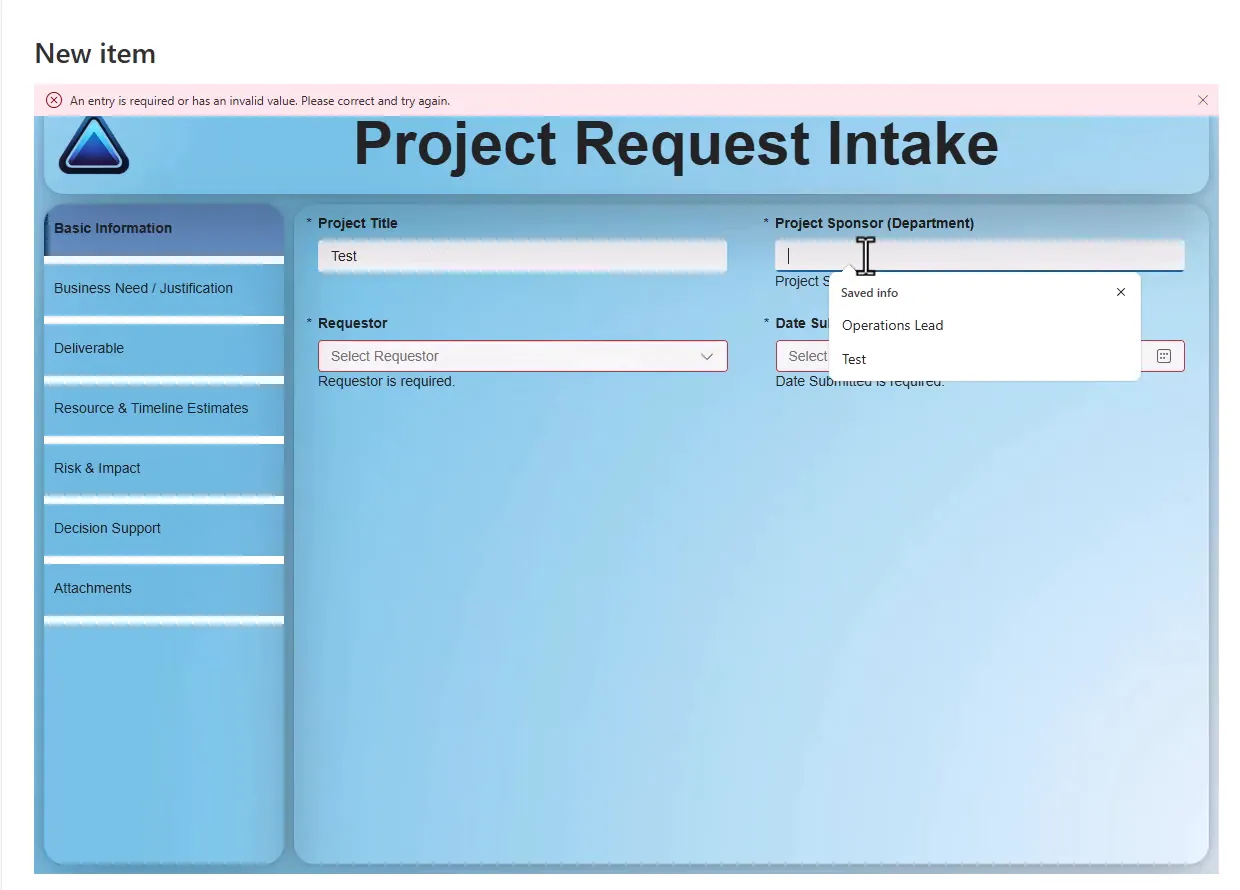
Select Save without filling anything in. You should see required messages.
-
Move through every section, fill in the form, and select Save.
-
Open the new item, and check that each value landed in the right column.
-
Open and edit an existing item as well, since Edit uses the same form.
Required fields can be on other sections. A required message appears on the card, so someone on Basic Information may not see a missing value in Decision Support. Check that the Needs attention cue from step 7 appears beside each section with a missing value, and disappears once you fill it in.
Troubleshooting
| Symptom | Likely cause | What to do |
|---|---|---|
| The old form still appears | The app isn’t published, or the page is cached | Publish, then refresh |
| Select Requestor shows nobody | Items needs the search text | Use Choices(..., Self.SearchText) |
| A chosen person shows blank | No display field | Add DisplayName on the Display tab, or set ItemDisplayText to ThisItem.DisplayName |
| A section shows odd gaps | Card positions | Check X, Y, and Width |
| Text sits in the middle of a box | Multiline is off | Set Type to Multiline (Mode on a classic text input) |
| Formula errors after deleting a control | Other properties refer to it | Rename the replacement control to match |
| Save doesn’t do anything | OnSave still submits the old form | Update SharePointIntegration |
| New form fields aren’t blank | Form mode | Check OnNew uses NewForm on your form |
| A control stops working after an update | A modern control changed | Restore from your commented formula, or use the classic control |
Companion video
Video: How to Build a Modern SharePoint Form with Power Apps (Hide the List!)
If the player is blocked on your network, open the video on YouTube.
Need help applying this to your own setup? Read about consulting.