 Office Solutions Pro
Fix personal views losing choice colors in Power Apps
Configure the Power Apps grid control at the Dataverse table level so personal views can display the same choice colors as your public views.
On this page
- Overview
- Before you start
- 1. Confirm which view loses its colors
- 2. Open the solution in classic solution explorer
- 3. Add the grid control to the table
- 4. Choose the client defaults
- 5. Enable choice colors
- 6. Save, publish, and check the personal view
- Keep other grid options intentional
- If colors are still missing
A public view can display colored choice values while a personal view of the same table displays plain text. If you encounter this mismatch, configure the Power Apps grid control on the table and enable OptionSet colors there.
The example uses the Task Tracker table in the Executive Task Tracker solution. Its public Incomplete Tasks view has colored Progress and Priority values. The existing personal view, Incomplete Tasks Filtered, initially has no choice backgrounds.
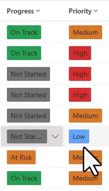
The public view displays the configured choice colors.
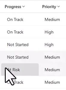
The personal view initially loses those choice backgrounds.
This procedure sets a table-wide grid default. Plan the change for the table’s other views as well. It does not copy every individual view’s component settings. Microsoft documents the table-level grid configuration.
Before you start
You need an existing Dataverse model-driven app, a customizable table in a solution, choice columns with colors already configured, and a personal view to compare with a public view. Substitute your own solution, table, and view names; you do not need to build the example task tracker first.
Use an account with the System Customizer or System Administrator role for customization. App users need appropriate Power Apps premium use rights for the model-driven app. See Microsoft’s customization privileges and model-driven app licensing guidance.
Check that the selected colors keep the choice labels readable. Keep the text labels meaningful so users can understand the values without relying on color alone.
1. Confirm which view loses its colors
- Open the model-driven app and the relevant table’s grid.
- Select the public view that already displays the desired colors.
- Open the view selector and select the affected personal view. In this example, the person icon identifies Incomplete Tasks Filtered.
- Compare the same choice columns in both views. Focus on the grid cells; the chart’s colors are separate from the choice backgrounds.
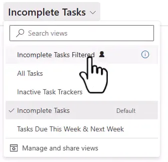
Choose the existing personal view to establish the before-and-after comparison.
Personal views retain their own columns, sorting, and filters. For background on creating and saving them, see Create and manage personal views.
2. Open the solution in classic solution explorer
- Go to Power Apps and select the environment containing your app.
- Open Solutions, then open the solution containing the table.
- On the solution’s command bar, select Switch to classic. If it is inside the … menu, open that menu first.
- Continue in the new solution explorer window.
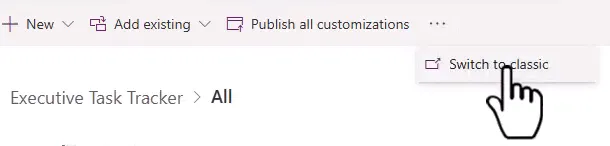
Open the classic solution experience from the solution command bar.
Microsoft documents this entry point under Solution explorer.
3. Add the grid control to the table
- In classic solution explorer, expand Components > Entities.
- Select your table, such as Task Tracker. Select the table itself, rather than opening one of its individual views.
- On the table’s Information page, open Controls.
- Select Add Control….
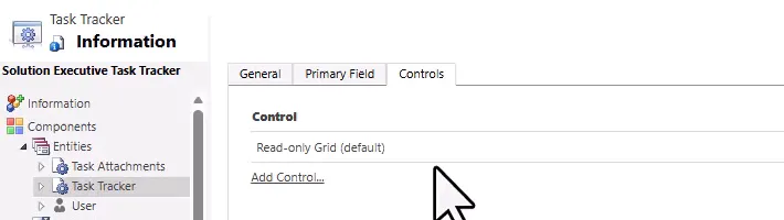
Configure the control on the table’s Controls tab.
- In the dialog, select Power Apps grid control, then select Add. Scroll through the list if necessary.
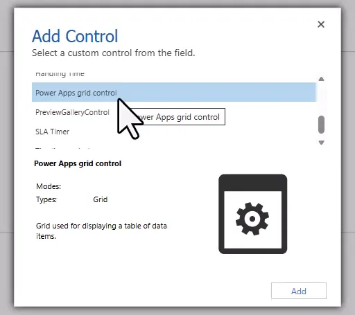
Select the control named Power Apps grid control.
If that control is already listed on the table, select its existing row and inspect its settings before making changes.
4. Choose the client defaults
On the Power Apps grid control row, select the radio button for each client where you want to use it. For the browser app, select Web. The example selects Web, Phone, and Tablet.

The second row is selected for all three clients; the previous default row is unselected.
These are radio buttons that assign the control for each client. Test each client you enable. Selecting Phone and Tablet does not replace checking the app on those clients. Microsoft’s classic control guidance explains the client selections.
5. Enable choice colors
- Select the Power Apps grid control row to display its properties.
- Scroll the properties list to Enable OptionSet colors.
- Select the pencil icon for that property.
- Under Bind to static options, select Yes.
- Select OK.
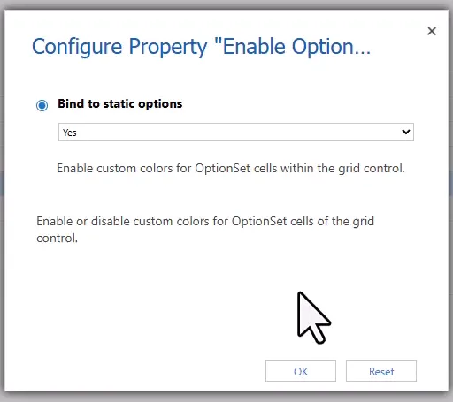
Set Enable OptionSet colors to Yes.
- Confirm that the property now displays Yes (Enum) in the control’s property list.

Confirm the value before saving.
This setting displays the colors already configured for choice values; it does not define a new color palette.
6. Save, publish, and check the personal view
- Select the Save icon on the classic command bar and wait for saving to finish.
- Select Publish and wait for publication to finish.

Save the table configuration, then publish it for app users.
- Return to the model-driven app and refresh the page.
- Select the existing personal view again.
- Check that the choice backgrounds appear and that the view still shows its intended filtered records.
- Switch back to the public view and confirm that its display remains suitable.
Also check the result with an ordinary app user’s account that has the intended security roles.
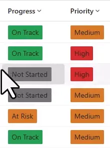
Incomplete Tasks Filtered now displays choice backgrounds on its six filtered rows.
Start by checking the existing personal view; recreating it is unnecessary in this example.
Keep other grid options intentional
Choice colors, inline editing, grouping, and nested grids are separate settings. Enable editing and Enable grouping default to No when adding the control. If your app needs either feature, configure it deliberately. Do not assume the values on an individual view’s Components panel have been copied to the table.
Nested grids require Child items and Child items parent ID configuration. A shared table default is not a substitute for planning different child relationships or view-specific layouts. This procedure configures choice colors and does not configure a nested grid. See the grid property definitions before extending the setup.
Changing the grid’s appearance does not grant access to additional records or permission to edit them. Dataverse security roles and privileges continue to govern those actions.
If colors are still missing
- Confirm that you changed the correct environment and table, rather than only the public view’s component.
- Confirm that Power Apps grid control is selected for the client you are using.
- Reopen its properties and confirm Enable OptionSet colors = Yes.
- Confirm that the choice values themselves have suitable configured colors.
- Confirm that both Save and Publish completed, then refresh the app and reselect the personal view.
If the mismatch remains, compare the affected view’s component configuration with the table default before changing additional grid options. Keep the public view and personal view available for that comparison.
Companion video
Video: Fix Personal Views Losing Colors in Power Apps Model-Driven Apps
If the player is blocked on your network, open the video on YouTube.
Need help applying this to your own setup? Read about consulting.